Creating a new food product is an exciting event for anyone in the food industry. The spark of a new idea, the planning, and finally, the packaging are all key phases of the process. When it comes down to product packaging design, you can’t spend enough time on it. The packaging is what customers use to decide whether they want to try the food inside. If the packaging is poorly designed, no one will purchase your product.
Packaging is used to tell your brand’s story, to protect the product during shipment, to make it easy to display, and to keep it fresh. You need to consider all of these factors when designing your food product’s packaging.
If you’re in the process of planning your packaging, here are 10 essential things to consider in its design.
1. Brand Identity
Establishing your brand identity goes well beyond simply putting your logo on a product. People recognize brands and seek out the ones they like. Branding helps customers find the products they are familiar with among thousands of competing products. Brand identity is also essential for the following:
- Builds loyalty
Kleenex didn’t become synonymous with tissues without the help of branding. Other brands have also managed to breed customer loyalty by offering niche market products that match their lifestyle. The line Brandless, despite its name, has powerful branding. Their simple packages that have no name beyond identifying the contents of the package speak to those who are tired of being continuously sold to. Another example of a company that has built a loyal following is Third Love, a bra company that has attracted customers by selling bras to fit their natural curvature. - Tells your company’s story
Every product out there has a reason for coming into existence. Whether it’s a food that sneakily slips vegetables into your child’s diet, an organic and GMO-free food, or something that’s just plain tasty, every company creates their food products for a reason. Proper packaging can share that story, helping customers see at a glance whether your food is a party in a bag, pure and healthy, or fresh and down to Earth. - Assures customers of company stability
No one wants to fall in love with a product only to have it disappear from store shelves. With huge brands like Borders, Hostess, and Toys R’ Us on shaky ground, it stands to reason that smaller brands are even less likely to stay in business. A solid brand reputation can help give customers the confidence to try a new product. - Makes small companies look bigger
Many small companies make the mistake of trying to save money by handling branding themselves. This can result in a look that isn’t quite professional. We’ve all seen a business card that looks like it has been printed off in a hurry or handmade websites that aren’t user-friendly as a result. These amateur items may repel the very customers they are designed to attract, dooming the business before it can even get started.
Brand identity is one of the most important things you can do to control the success of your product and is well worth spending extra time and funds on to help make your product a success.
2. Form, Function, Beauty
Taking a page from architectural design services is not a bad idea when designing the packaging for your food. Packaging needs to be attractive to convince people to buy it, but it also has to be functional. For example, when the Sun Chips company tried to strengthen their brand by using compostable bags, they didn’t account for how loud the bags were. They were so loud, in fact, that Sun Chips pulled the chip bags when videos of people measuring the decibels of opening them popped up online.
The compostable bag was a great idea in terms of branding and beauty, but it was too loud to be functional. Food product packaging needs to look good on store shelves, fit well among other products, and protect the food it contains.

On the other hand, Colour Me Blind nailed it with a highly functional line of grocery products aimed toward the visually impaired. These products are uniformly slate gray, with any embellishments raised so that they can be felt as well as seen. The words are written both in English and in Braille, with the aim to make going to the grocery store for the blind as easy as it is for the seeing.
The brand also aims to start discussions around the difficulties facing the blind. Their packaging combines function, beauty, and branding in a way that makes their products stand out.
3. Make Sure the Packaging Compliments the Contents
Chips need to be in a container that protects them from being broken during shipment, as does cereal, cookies, and other more delicate food products. Perishable goods need packaging that can stand up to condensation and other factors found in the freezer or refrigerator sections.
Another thing to keep in mind is customer expectation. A can of soup that doesn’t have a pop-top can be disappointing to a customer who has gotten used to the experience. No one bats an eye at using wax as packaging for cheese, but this might not work as well on another product.
RELATED: 10 Tips for Good Product Design
Packaging has to meet the expectations of the consumer, find a way to be original, and also meet food safety laws. It can be a difficult balance to make all of these factors work together.
Pringles, the famous chip company, managed to do this with their iconic chip canisters. The canister successfully protects the chips from damage, preserves flavor, and meets customer expectations. It’s a great example of a company that managed to solve all their packaging problems in an innovative way.
4. Keep It Simple
With so many food influencers casting a critical look at ingredient labels, conveying the simplicity of your product has become more important than ever. The days of busy labels filled with dizzying amounts of color and information are over.
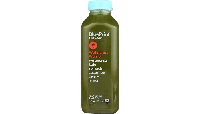
Designers have started leaning toward product packaging design that represents the main focus of the product in a single image in the center of the packaging and filling the rest with white space. This design style not only creates a timeless look that rises above trends. It also helps customers perceive your product as cleaner than similar products and improves design versatility.
If there is something special about your product, make that the central theme of the packaging. Is your packaging completely bio-degradable and environmentally friendly? Showcase it. Do you only use a select number of simple ingredients to make your product? Make the main ingredient the focus of your packaging design.
5. Design Versatility
It’s a satisfying moment when you have created a brand that consumers readily recognize and enjoy. But what happens when you need to move that brand to a different style of packaging? If your product becomes popular, consumers may demand your product in snack size options, in bulk, or paired with other favorite foods. This means that if you don’t design carefully, the design people have come to associate with your product may not transfer well to different types of packages.
Having a design that can be readily transferred to packages of different sizes is a useful strategy for your brand’s longevity.
6. Introduce Limited Editions
When the first autumn leaves begin to turn, many of us rush to our local coffee shops to get the first pumpkin spice flavored items on the market. Thanks to modern technology and transportation, we have largely lost the seasonality of food that used to be a big part of our culture. But when food is available all the time, it starts to lose its appeal. By making something limited edition, you increase demand from customers who know their chance to experience it will be short lived.

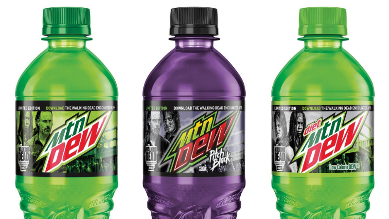
This doesn’t include only seasonal items. Mountain Dew is famous for releasing limited edition drinks, and Lay’s is well known for limited edition potato chip flavors. By coming up with a unique flavor for your product and selling it only some of the time, you can encourage more people to look for your product in the hopes of seeing their favorite flavor again.
7. Explore Material Options
Packaging for food tends to use the same materials over and over for several logical reasons. Packaging isn’t there only to be beautiful. It has to protect the food and keep it fresh as well. That means packaging materials are often plastic, glass, or other sanitary materials that are cost-effective and efficient.
If you’re in a niche market, you can try to stand out by switching up the materials commonly used in your area of the food market. Milk regularly comes in plastic or cardboard jugs, but select dairy farms have gone back to bottling their milk in glass – a novelty that consumers love.
Even though food has a limited number of materials that can be used in its packaging, being creative with acceptable types of material is a great way to draw attention to your product. Firewood Vodka stands out in a liquor store because the outer packaging of the vodka bottle is wood.
The bottle provides a certain amount of whimsy, and the material contrasts with the sea of plastic and glass surrounding it, making it a natural draw for curious shoppers. It’s a great example of packaging done right – a lesson other packaging designers can learn from.
Another brand known for interesting packaging is Cuberdons. Their cookies are sold in glass jars instead of the typical rigid plastic, and they’ve also used other exciting materials in the past such as a hatbox that contains their confections paired with a partner brand’s chardonnay. The unique packaging of this line makes it easy for customers to spot and suggests luxury within, matching the brand’s image.

While there are obvious limits to what you can do regarding materials, finding materials that can help your package stand out is an excellent way to get ahead of competitors.
8. Use Creativity to Cut Costs
Ornate packaging for high-end luxury goods is all well and good, but what about packages for products intended for consumers on a tighter budget? Creating a beautiful package that will attract customers without relying on expensive materials can be a challenge, but innovative solutions can often help keep costs down and make for great packaging too.
One package that stands out as unique but with low-cost materials is the Happy Eggs carton. Packaging designer Maja Szcypek wanted to create a package for the eggs that was completely sustainable, bio-degradable, and unique. While egg cartons are readily recyclable and mostly bio-degradable, they still have a carbon footprint.
The Happy Eggs cartons are made from compressed hay, and their packaging is designed to look like a tiny haybale. The packaging uses materials that are cheap, always available, and utterly unique, but also perfectly suitable for the product being sold within.
With some brainstorming, it’s possible to come up with packaging that answers all the needs of your food product without being prohibitively expensive.
9. Explore Pattern and Color Options
A pop of color can help attract the eye of consumers and so can changing up the texture or pattern of a product. WebPageFX asked customers to judge a product in 90 seconds or less and found that between 62 and 92 percent based their opinion of a product on the color of the packaging alone.
When a customer is walking down a grocery aisle, you may have even less time than that to get the attention of someone trying to decide on a product. It pays to give the color and pattern of your product some consideration.
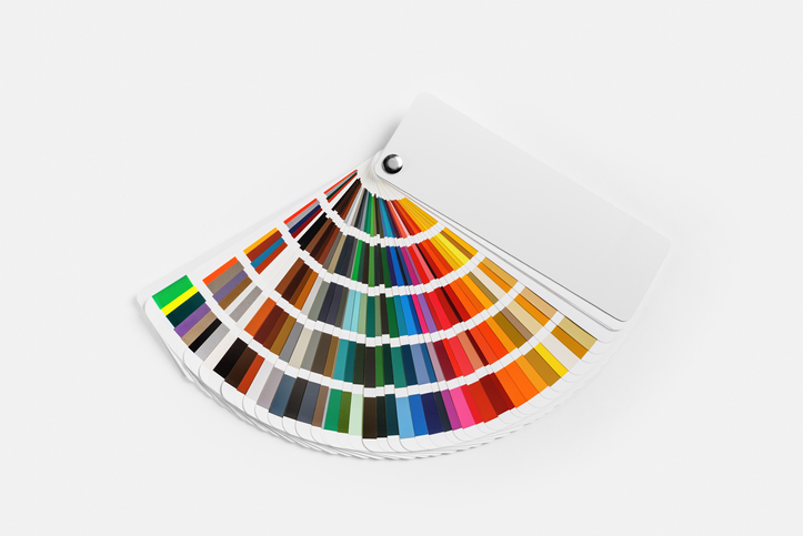
Different colors influence consumers in different ways. Yellow is one of the fastest colors processed by the human brain and typically stimulates appetite while also putting customers in a good mood. Blue, on the other hand, is considered an unappetizing color but is associated with honesty by customers.

If you want one color to dominate your packaging, researching how customers perceive it first can help guide you through creating your packaging.
10. Use the Packaging to Showcase Benefits of the Product
When a customer picks up a product that interests them, they often look to the packaging to tell them whether the product offers what they want. For a weight conscious person, this may be checking how many calories it has, whether it is low in carbohydrates or whether it meets other dietary restrictions. For others, they might be wanting a spicy snack or an indulgent treat.
For your packaging to attract the right sort of customer, it needs to showcase the best features of the food within. Is it meant to be a healthy drink? An exotic treat? Whatever the product is designed to offer needs to be front and center on the packaging.
This isn’t always easy to convey. Pasta is a universal product that would look out of place dressed up as a luxury item. Creating a package that inspires customers might seem difficult, but one design studio made theirs stand out by offering a pasta package that could dole out one or two servings at a time, solving a problem many consumers have.
Cad Crowd Has Packaging Designers to Help
Looking for a fantastic freelance packaging designer to help you create the packaging for your next product? Cad Crowd is the industry leader in matching clients with freelance designers from around the world. All of our designers are pre-vetted, saving you the time and stress of finding a qualified designer for yourself. Send us some information about your product and get a free quote on its packaging design today.
