The minimalistic style is the current favored look for product design services. Customers are tired of being advertised to, and a simple look is not only attractive but is perceived as more honest. Here are 20 minimalistic styles that have really worked for their brands.
Design Torget

Design
ASARAI
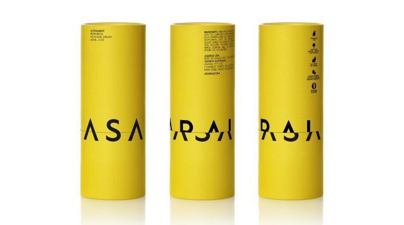
The minimalistic style doesn’t always have to be white or clear. Although these are the predominant styles of packaging for many products,
Zara
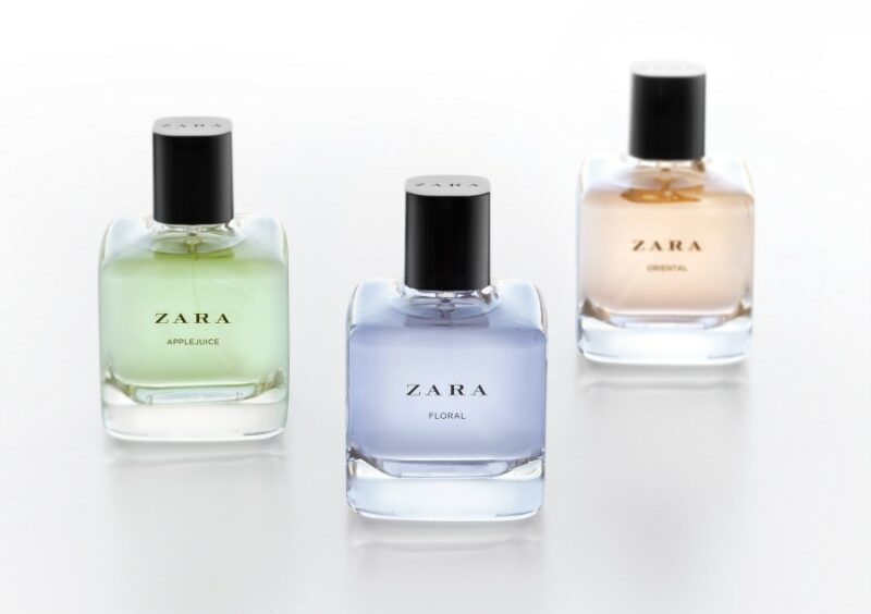
Lavernia & Cienfuegos was asked to redesign a bottle for Zara so that it was similar to the older model but updated with a fresh new appearance. They rocked it by taking the square look and giving it rounder edges and a more seamless appearance. The result is a gorgeous bottle that is recognizable as the same perfume but much improved.
The Shirt Never Sleeps
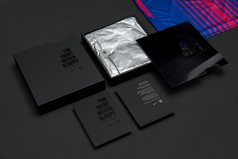
If you’re a soccer (or football, depending on where you live) fan, you’ll love this shirt. Barcelona-based agency
Femme
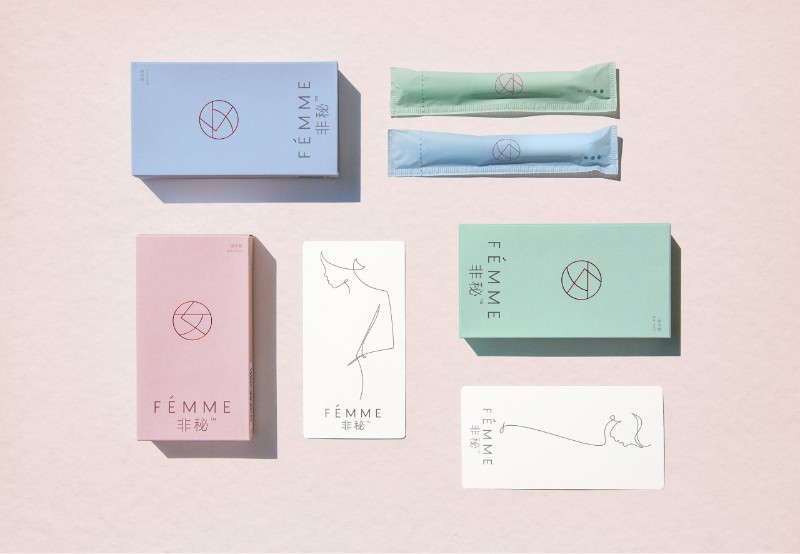
When purchasing feminine care products, who wants loud, in-your-face packaging? One Chinese company is making its mark by designing their packaging to be more discreet. The gentle colors and beautiful design may be enough to help the company break into a notoriously difficult market.
Soylent
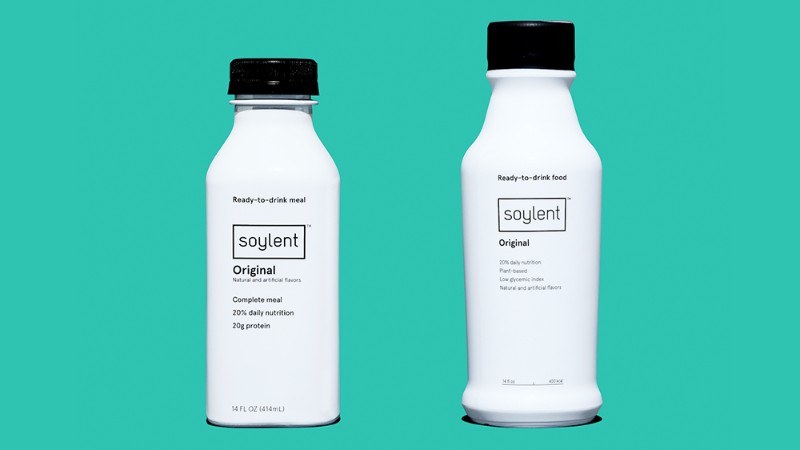
Soylent is a meal replacement designed to simplify your life and save time. The packaging is designed without any frills to help carry that message forward. The bottle is plain white with black text and a black lid. It’s easy to read and keeps things simple – just like their product. Small splashes of color help divide the products up so you can easily identify what you’re looking for, making it both beautiful and functional.
Moodcast
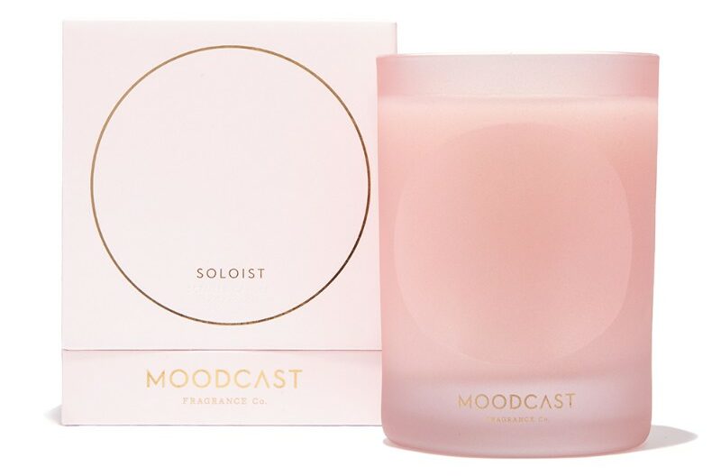
Bright colors and gold detailing give this packaging a bold yet simple design. These beautiful accents make the difference between an average box and a package that makes a statement. These packages are designed to look like retro Finnish glassware, making it unique and beautiful.
Cocofloss
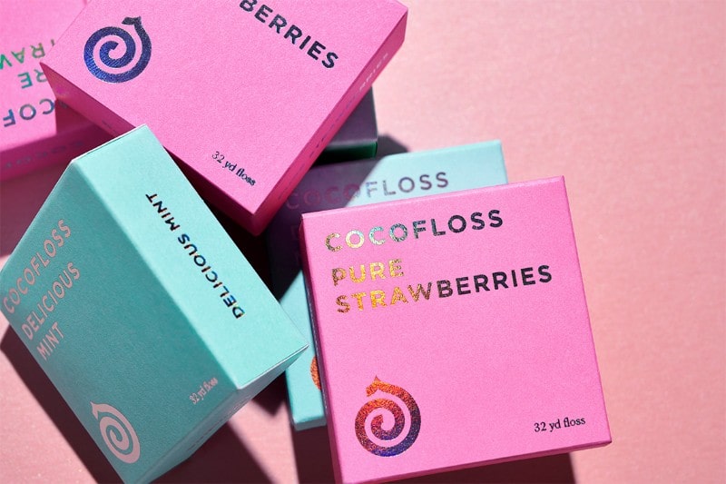
Minimalism doesn’t have to be about a single solid color. Cocofloss is all about fun, natural products. Their charismatic packaging comes in two tones and keeps a playful look without being too busy. This design pulled off by Anagrama is both minimalistic and beautiful.
Chapter 2
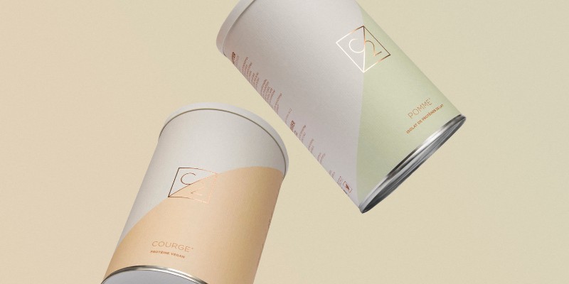
When we think of protein powders, we tend to envision large white bottles with loud labels. Chapter 2 is taking protein powder in a different direction, with refined and even elegant packaging that goes against the grain. This beautiful packaging brings elegance and style to taking care of your health.
When the designers set out to create Chapter 2, their goal was to create packaging that would make fitness less of a barrier to break into. The idea was to create a package that was less masculine and appealed to a wide audience. The results are beautiful.
Morho
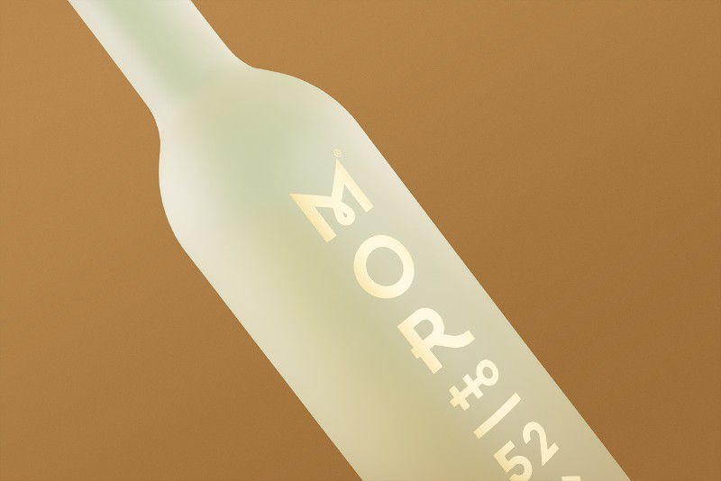
Morho is a hand malted rye spirit based on an original recipe by the company founder’s grandfather. When Michal Slovák set out to create the bottle design, the goal was to create a minimalist look blending folklore and modernism. The result is a fantastic bottle that is both memorable and sleek.
Michal Slovák avoided the traditional folklore additions we commonly see on bottles and went with symbols that help put together the look we see on the bottle.
Shopping List
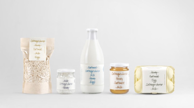
This playful package uses a novel twist to make their point. The label shows a shopping list of a few items all crossed out, with the name of what is in the bottle left unmarked. This unique label both tells you what is in the bottle, while at the same time making it unmistakable from other nearby products.
This fun change is a unique way to take simple packaging and refine it into something cute and unique.
Public Goods
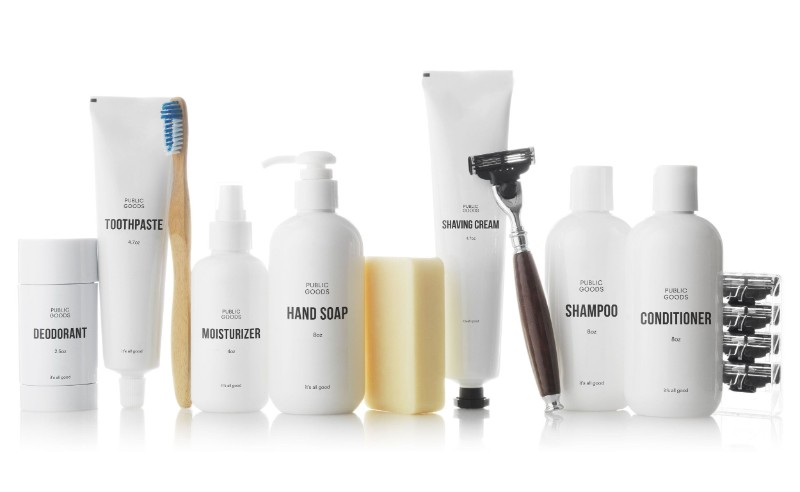
What do you do when you want products that are both good for you and affordable? You buy Public Goods. Public Goods can offer lower prices through direct-to-consumer marketing by plain packaging. The white bottles with simple text not only save money, but it has become a form of branding on its own. The design is similar to the “Brandless” company which deals in products that aren’t specifically organic or high end in other ways.
Diz-Diz Popcorn
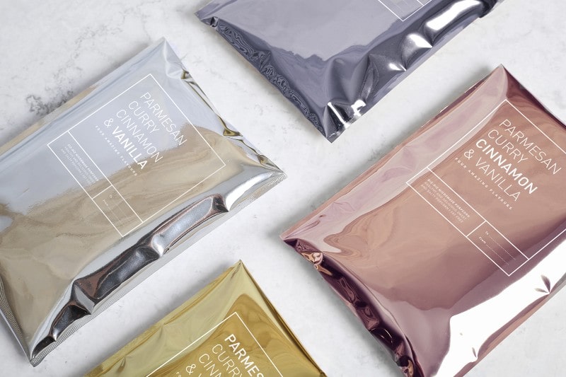
Diz-Diz Popcorn is changing how we think of popcorn. Instead of a dull, slightly greasy looking bag, this gourmet popcorn company is dressing up their bags with more elegant materials. The microwave-safe packaging looks more refined with marble and metallic materials for each flavor.
This fun packaging is as unique as the flavors they are famous for, making every package a treat all in itself.
Playa
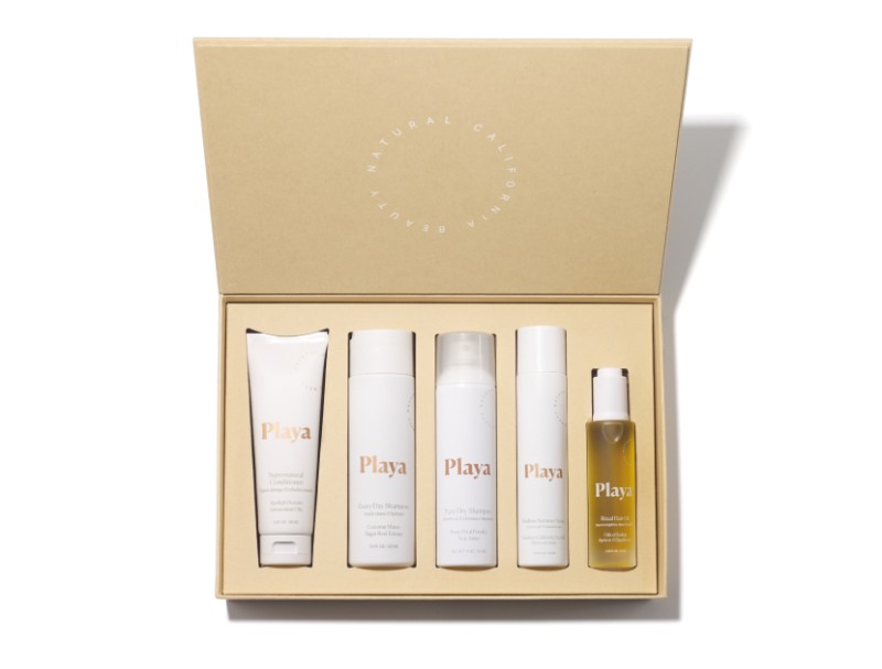
Playa is a haircare product using natural oils to bring out the best in your hair. Along with simple, quality ingredients is packaging that suits the product. A beautiful gold box houses the product line, with a selection of white and clear frosted bottles inside. The packaging is both easy to use and minimalistic.
Hinoki
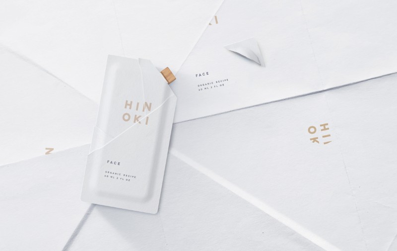
This award-winning packaging has it all. The design is beautiful and elegant, with packaging that was created with an eye towards a minimal impact on the environment. Hinoki is a brand designed for travel, so all of their products come in trial sized packets. What makes them stand out from other lines is the fact that their products are made from biodegradable paper.
In a world that is becoming more and more concerned with single-use plastics, Hinoki is winning hearts with its environmentally friendly options.
Neoderma
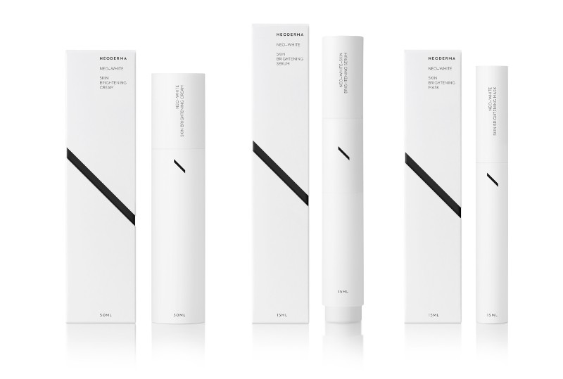
When the designers of Neoderma set out to create their packaging, they wanted to come up with a timeless design that would reach a new audience for their product. Their all-white design is highlighted by a diagonal black line and an emphasis on the letter “N.” The result is an eye-catching package that will still look fresh years down the road.
Krone Beer

This packaging designed by Creuna shows what a creative designer can do when they put their minds to it. Krone beer is an organic line of beer intended to compete against top labels. The makers of Krone Beer gave Creuna a free hand in the design. Their theme: A beer that makes you feel like royalty.
The vibrant colors, frosted finish, and elegant print all carry these elements while still giving the product its own unique finish.
And Union
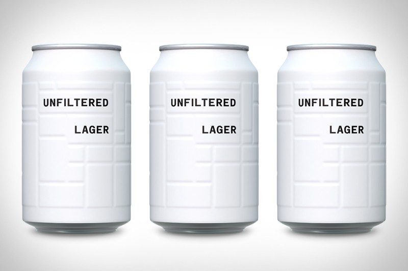
And Union introduced a minimalistic brew just a couple of years ago. Thanks to their popularity, they are introducing new and similar lines. The cans are in bold, solid colors with simple type. The package uses texture rather than other tricks to make the package pop.
Each can has an embossed design that is pleasant to feel as you’re sipping a cold brew, making them a pleasant experience both visually and physically. The cans stand out on a shelf with their bright colors and are easy to identify due to different colors for each type of beer.
Simple, practical, and beautiful, this packaging does it all.
Ringana
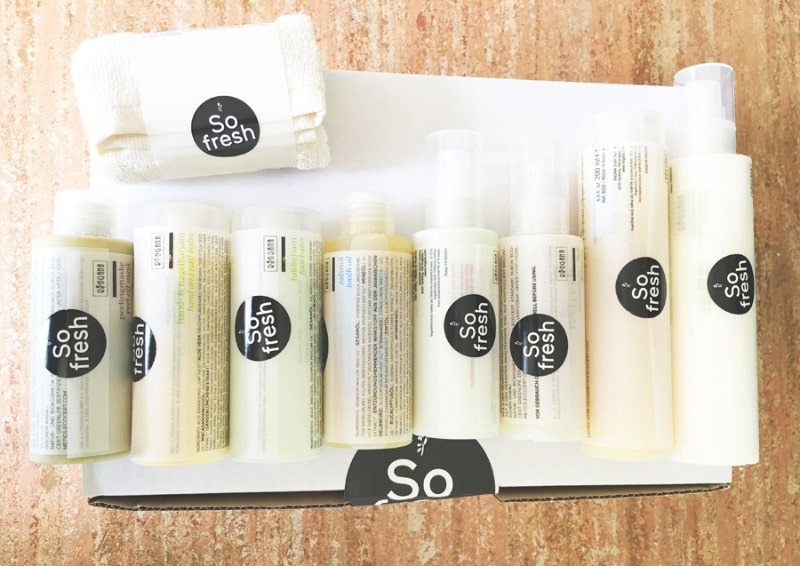
Bright colors and clean looking sans serif font combine to give this packaging a very clean look. Ringana is a product line that emphasizes the purity of those products. The idea is to focus on what is inside the product, not necessarily the package itself. This scheme is used across all of their products, helping to support brand identity.
Moodley spent several years planning and designing this packaging line. The packaging is made of 100% recycled materials—essential to the demographic they are reaching.
This thoughtful and meticulous care of the customer comes out in every possible respect with this packaging, making it unique and timeless.
Henri Sodas
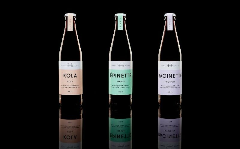
With its pastel color scheme and simple labeling, Henri sodas let their product speak for itself. Seeing the soda itself is novel to customers, making it a refreshing and unique look.
All of these packages are tied together by the fact that they keep things simple. The fact that this style can be made into so many different types of packaging is encouraging for those trying to create their own unique packages.
These products are certainly winning it with their beautiful and unique designs. If you’re looking for what’s fresh and new in the world of design, let Cad Crowd help. We have a network of freelance packaging designers who would love to assist you with your design. Find out how it works.
