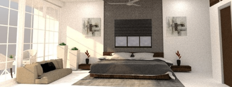
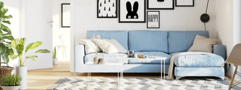
The unanimity among interior designers, amateurs, and professionals alike is that SketchUp offers a user-friendly alternative to the more complex software commonly used in the architectural discipline. However, the application is also free for the public.
Like every interior modeling software out there, it takes practice to get familiar with everything that SketchUp can do. The following tips for using SketchUp for internal design modeling can be helpful if you’re exclusively a beginner.
 Table of Contents
Use SketchUp from the Get Go
If the plan is to use SketchUp to model an interior design, we recommend using the application right from the beginning when doing the initial rough sketches. Make sure to write down the measurements on the screen since you will use SketchUp anyway.
Another reason to use SketchUp from the get-go is to create better accuracy. Once you transcribe the measurement on screen, you can have a basic understanding of what the room will appear like during the design process.
Get Familiar with “Layers”
In SketchUp, the layers option offers a great deal of control over the model and provides an excellent method to showcase multiple interior design choices in the same space. For example, it is easy to create two or three different layouts in a living room environment and put them on corresponding layers.
Each layout is put on its layer, allowing you to toggle it on or off without changing the entire model. You also don’t need to draw separate living room spaces for all the layout options. SketchUp also allows you to add individual scenes for every layout to switch between the options back and forth more easily.
Lock the Walls and Floors
When you’re working on interior design modeling, chances are you don’t need to move the walls and floor very often. However, it’s not uncommon for even a seasoned user to accidentally move those two significant components as you try to slide furniture, rug, decoration, or other interior design elements. Sometimes the cursor hit the wall by mistake, moving it ever so slightly before you set it down. The change of position may not be so apparent. Walls, floors, and essentially the shell of the building must stay where they are meant to be.
You can prevent any accidental movements by locking the walls and floor as soon as the designer inputs them in an accurate position. Once the geometry is secure, you cannot slide the walls and bases on the screen. It is useful when trying different room layout arrangements and moving various interior pieces.
Organize the Geometry as You Go
One of the most challenging things to do in SketchUp is to go back and reorganize everything. If you need to create different groups and layers throughout the modeling process (which you most likely will), never wait until you have too many pieces to organize. The point in organizing separate fragments into their groups and layers is to prevent them from unintentionally merging and ruining your progress.
As you start designing the interior design of a house, you may need to create some interior walls connected to the floor and exterior walls. Without groups and layers, your interior walls will merge with everything else they touch. Once combined, you cannot modify “only” the wall by adding a door or specifying different heights, hoping it will not affect other components.
Use Tape Measure Tool
You can create a guideline within a SketchUp model to draw new walls, partitions, doors, and a lot of other things using the tape measure tool. The guideline will create new lines in the dimension you need inside the model without merging with any geometry. It is much like using a tape measure in real life to delineate specific points. The guideline does not split faces or even intersect with the existing geometry.
Say you want to create a door in a wall with the geometry grouped separately. Utilize the tape measure tool to determine where the door positioning and width. To specify the width, make sure you draw two guidelines properly distanced between the desired width, parallel to each other but perpendicular to the wall. With the guidelines outlined, you can push/pull the wall without filling up the section for the door.
RELATED: Top SketchUp Plugins Used by 3D Rendering Companies

Lock the 2D Floor Plan Layout
Sometimes it gets tricky to place things like furniture and ornaments in 3D view due to the perspective. To avoid putting the objects in incorrect positions, lockout the space or area while still working in a two-dimensional floor plan view.
The “space” can be a rectangle, square, circle, or any other shape corresponding to the 3D objects you want. Another important thing is to specify the dimension of those spaces to fit the length and width of the entities. You can draw the areas on the floor or wall and put them on their layers.
SketchUp can hide or reveal the spaces when you are in 3D mode, so basically, they act as points of reference when you are ready to place the objects. If you need to swap things, the spaces will still be there as a guide.
Keep Everything Aligned
Before adding another interior design element:
- Pay attention to the axis and ensure everything is aligned correctly.
- Always look for those red, green, and blue lines each time you draw and move throughout the model.
- When you are unsure whether or not the geometry is aligned, go to the Styles window, click Edit, and choose the “By axis” option from the dropdown menu.
The option will turn all the edges in the model into red, green, and blue lines, but only if they are geometrically aligned with the axis. Black color edges are out of alignment, so you need to repair them. It might not be a problem in objects not directly connected to the main structure, such as a table, trim, fireplace, etc. Still, on essential components, misalignment can cause many issues in the design, such as when you need to add doorways and windows to a geometrically incorrect wall.
Do Not ‘Over Model’
There are thousands of ready-made assets from 3D Warehouse or other resources; hundreds of them will probably fit well with the interior you are designing. It is easy to get distracted by those tiny, good-looking, colorful ornaments as you are working through the schematic design. You’re more likely to drown yourself in the countless decoration options when you get distracted.
Understandably clicking 3D images of candleholders, wooden sculptures, lighting fixtures, plants, and other seemingly limitless details is a lot of fun. The downside is that all those assets can instead weigh down the interior design model and sometimes hide the crucial features you want to highlight, such as the layout and roominess. Adding the little details is necessary when you are at the final stage of the design process. And otherwise, it distracts you from the job and is a big waste of time. Save that for later when rendering the image.
Use 3D Warehouse Wisely.
Interior design in SketchUp always involves 3D Warehouse, where you can find countless assets to use as furniture pieces, ornaments, and decorations. Due to the sheer number of options, the general belief is that a 3D Warehouse contains the exact piece of furniture you need, no matter the size, color, and pattern. Although this can be true, never get trapped in a relentless search for an exact match.
It is not 100% necessary to find a duplicate of the specified furniture. Even if you know that the object exists in 3D Warehouse but haven’t found it yet, there is nothing wrong with using something similar. An asset that is an “acceptable representation” of what you need is good enough and easy to modify as well. You can rescale the asset, add material, or change the color later. Also, you can get an image from a tear sheet and include that when presenting the design to a client.

Add Materials Later
It is time to add materials to the objects when you are toward the end of the internal modeling process. Once again, it can be tempting to get precise details on every 3D object in the middle of the work. Some clients even like to bring pieces of fabric, paint swatches, or textured objects for you to implement in the design. Unless your work is about to finish, file those items away and continue working on space design and layout.
Remember to design the whole interior space, not just the rug and kitchen countertop. Getting hung up in those details can instead prevent you from completing the job on time. More importantly, those details make it more challenging to see the edges when fixing the geometry.
How Cad Crowd can help
As exciting as it is to begin a DIY project with SketchUp, we also understand that time and peace of mind are valuable. Here at Cad Crowd, our team of vetted professionals specializes in using SketchUp modeling for any industry besides interior modeling. Hiring a specialist will also give you access to high-quality services to provide a stellar design. Come and chat with us by submitting a brief and we’ll send you a quote right away. Click here to get started.

I’m looking for 3D models of my house remodel. Learn sketch up sounds time consuming. Do you do this king of work. What is your feed?