Companies spend significant time, effort, and money to develop attractive product packaging design because of their essential role in driving sales and creating a distinctive brand. The packaging is the first thing consumers see and also perhaps the thing that they remember when they leave a store. As the market becomes increasingly crowded with new companies surfacing rapidly, many consumers have trouble differentiating products with similar functions and features. New product design competition is harsh, particularly for startups that want to penetrate markets that are filled with established brands.
While the packaging is primarily intended to keep the product inside intact during distribution and storage, it has become a platform for marketing, into which companies are pouring resources with the sole purpose of showcasing any product’s value and quality at a glance to both competitors and customers. There are countless design approaches to create attractive packaging. Here are some of the most popular trends today.
1. Minimalist
In contrast to its name, creating a simple, minimalist design is a complex process. Being simple doesn’t mean there’s a tolerance for a lack of substance, but rather a good design compiles all essential information in a concise, compacted way. Minimalist packaging has been around for some time indeed. However, it won’t lose its place anytime soon. Some people may think of it as a rudimentary (or even primitive or lazy) approach to packaging until they realize how difficult it is to use the right symbols and visual imagery to deliver what is needed. Communicating using few words, or none at all, is an art in itself. Assuming the product needs additional information, such as ingredients, warnings, or instructions, minimalist packaging compensates by providing reading materials inside the packaging. The minimalist approach helps to spark curiosity in buyers’ minds.
2. Pastels
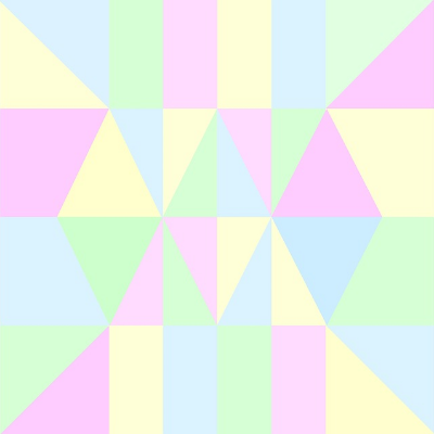
Simplistic packaging is not synonymous with the absence of color, either. When you use the right colors, it’s possible to combine a minimalist packaging approach with colorful design. The key to a good mix is avoiding going overboard with contrasts. Any pale color creates an attractive counterbalance to overwhelming, bolder, or more explosive packaging designs. Pastels are commonly associated with warm, soft, welcoming images. The shades of pastels – even when mixed – are easier on the eyes and the mind. Instead of striking consumers’ sight with a sharp blend of vivid saturation, you want to deliver calm visual effects.
3. Colorful Graphics
While minimalist and pastel designs are becoming increasingly popular, there’s a good chance that you’ll still come across plenty of products wrapped in bold, colorful packaging on store shelves. One of the biggest advantages of explosive color combinations is making products stand out, especially for products heavily marketed towards kids and teenagers. Food and beverage is the dominant category for this sort of packaging design; ice cream, snacks, soft drinks, spreads, children’s clothing or fashion accessories, and toys are some of the usual players in this category. Packaging with bold graphics or patterns is all too common in children’s and teenagers’ sections, unfortunately, and this fact is why a clever distinguishable mix between colors and images is necessary to lure your target consumers to buy.
4. Doodles
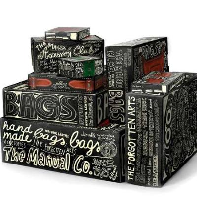
One variation of erratic colorful graphics in packaging is doodled designs. The combination of colors remains a prominent feature but added are seemingly erratic elements that appear to be hand-drawn or handwritten. Sometimes images look abstract, and the wording doesn’t seem to have a comprehensive meaning. When put together, however, all these elements represent a clear message about the product’s intention, purpose, or shape or the company’s identity. The biggest appeal of doodled design is that the visual effects are crafted so that they look devoid of seriousness.
Behind the superficial randomness, the packaging still provides product details with meaningful buyer information. A doodle literally refers to a random or aimless drawing. It’s all about freedom of expression on the designer’s part, whereas consumers unconsciously practice the freedom of interpretation, making the product’s overall appeal much stronger.
5. Movie Posters
All packaging designs generally want to communicate to consumers information about the product. You can deliver the message simply by using words, images, or a combination of both. The way that the combination is crafted makes all the difference between an attractive package and an otherwise unappealing one. A creative way of telling a story with packaging is in a movie poster design. There are dozens of approaches to creating an eye-catching poster. Some effective methods include: abstract images, pencil drawings, image-heavy, plain, or mysterious, to name a few.
There isn’t any objective measure to determine if a particular movie poster is good or bad because it depends on personal preference. However, you want the packaging to tell a small part of the product’s story. When done correctly, the packaging sparks a curiosity that tempts consumers to buy the product.
6. Vintage
People often associate the term “vintage” with “old-fashioned.” They aren’t entirely incorrect, although the term carries a lot more meaning than just a reference to age. As technical jargon, vintage refers to the year in which wine is produced or when the grapes for winemaking are harvested. The word today has a broader meaning because it describes all items produced in decades gone by, not only the items reminiscent of a past era but also items that were popular or of good quality. When implemented in packaging design, vintage often means the use of straightforward labels, boxes, or stickers with a ubiquitous typeface. The message of vintage packaging design is a dedication to tradition and the persistence to maintain the same quality that the previous generations praised and loved. The vintage approach can be a reference to traditional manufacturing practices or the fact that the brand has been around for decades if not centuries, an explicit suggestion of unchallenged quality.
7. Typography
Lettering and graphics don’t always need to occupy their own separate spaces on product packaging. Clever wording and creative imagery can blend to create enticing elements that become the dominant features of a package design. Typography is about highlighting the visual components of the written words. All the irregularities and imperfections apparent in every letter deliver a strong sense of the handmade touch to which everyone can relate. A collection of words in a particular configuration, combined with the use of a striking typeface helps build an irresistible desire for customers to take a closer look. There isn’t any rule on how to approach typography design, as long as the typeface used is distinguishable without sacrificing readability. You can even draw any shape by arranging the words irregularly.
8. Large Text
Some packaging designs take the minimalist approach to its bare bones by using nothing but clear, simple words. There can be other elements such as a barcode or some logos, but the main message is the undisputed focal point, written as clearly as possible. Such design limits the number of distracting features that prevent consumers from reading the words from several yards away. To make it even more readable, the words and backgrounds are written in contrasting colors. You might assume that the written words should tell consumers about the products, but in reality, the message can be anything funny, motivational, ridiculous, fictional, hyperbolic, or downright insulting. Written in big plain words, the package is easily noticeable, too.
9. Unusual Shapes
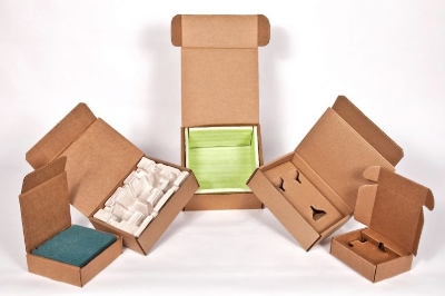
Images, colors, and typography are proven effective methods to achieve a desired visual effect regardless of the products. If you want to take it to the extreme level, there are very few approaches that work better than changing the shape of the packaging itself. Most product packages are in simple regular shapes. Uncommon, unique packaging shapes serve well to attract consumers’ eyes. Why not animal shapes, fruits, cardboard houses, or maybe a coffin? As a rule of thumb, the packaging shape should be relevant to the products.
10. Recycled Materials
Consumers like resealable plastic bags, plastic bottles, and hard plastic boxes as product packaging. The material is quite durable, sometimes even waterproof. As concern grows for the increasing use of plastic in household items, more people are starting to realize the importance of buying products made from recyclable materials. While some packaging cannot (and should not) be recycled, consumers are now more inclined to purchase items packaged with recyclable or biodegradable materials to minimize plastic waste. If you can, design your packaging using recycled material, and don’t forget to make sure your customers know. Communicate to consumers that your products (or the packaging) are a part of the movement towards a cleaner, healthier Earth.
Read our post on Sustainable Packaging Design Tips to learn more about sustainable product packaging.
11.Cutouts
Packaging is meant to protect the contents inside. Because of the nature of the products like foods and batteries, some packaging helps prevent exposure from direct sunlight. In that case, the packaging hides the product from view. Often, it’s possible to use the product itself as an element in packaging design. If the material allows, you can make a cutout or two in the packaging to expose small parts of the product. Any material that is at least as rigid as cardboard is excellent for using with this approach. Incorporate the exposed portion of the product with graphics (text or images) on the packaging. To keep the product reasonably protected, replace the cutout portion of the packaging with thick clear plastic.
12. Laser Cut
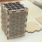
Many consumers are willing to pay more for products offered by companies that demonstrate exceptional attention to details. These consumers tend to appreciate the hard work the product creator put in to bring the goods to market. Not only do these creators communicate their efforts through the product, but also through its packaging design. One of the most common methods uses good quality materials, such as stainless steel, anodized aluminum, acrylic, or even glass. Putting visual graphics or lettering on these materials isn’t as easy as printing images on paper. To incorporate graphics with precision, the packaging materials are laser etched or cut. It’s also possible to apply the same treatment to paper or cardboard for accurate results. Laser cutting does the job right the first time. There is no need for further processing.
13. Photography
Images on packaging can be realistic as opposed to abstract or graphics. An easy way to achieve that is to use photographs related to the product. You can find plenty of products wrapped in packaging that feature real photos. These products are anything from pet supplies and accessories, clothing and cosmetics, and food and beverages. Whether or not the design is effective and attractive depends on the creativity of the photography and its implementation (color, position, print materials) on the packaging.
You need to treat your brands as if they’re extensions of your company’s identity. The way you communicate to consumers about your products even before they spend any money is a crucial factor influencing their decision to purchase. An effective marketing campaign is indispensable to inform potential consumers about your company and its products and values. A marketing method is effective when it delivers a straightforward message that consumers perceive in the same way. With that in mind, the delivery system, in this case in the form of your product packaging, becomes an aspect of marketing worthy of serious consideration.
In addition to being a protective shield, the packaging is probably the most straightforward medium for communicating the most appealing aspects of the product. Is it fun, healthy, durable, affordable, environmentally friendly, luxurious, disposable, charitable, or some combination of these? The implicit or explicit messages you put on the packaging can be crafted creatively to deliver information while improving the chances of making sales effectively. In short, product packaging is a visual information delivery system that doubles as a marketing platform. The way this platform is used reflects how much you respect your consumers and demonstrate the values you hold.
Need help with new packaging design?
Need help with new packaging for your product? Learn more about how we can help you hire freelance industrial designers for CAD services on demand.

