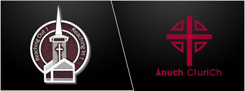
What’s the very first thing that people notice about your church? It’s your logo, of course! Believe it or not, your logo can make or break the success of your congregation. But what if your church logo no longer serves its purpose? Well, it only means it’s finally time to give it a modern twist! If you’re considering updating your church’s logo, consider exploring contemporary church logo design concepts and 3D logo design services tailored to your organization and its members.
 Table of contents
- Current trends in church logo designs
- Tips and ideas for great modern church logo designs
- How Cad Crowd can help
Current trends in church logo designs
Today’s church logo designs prove how more churches are embracing trends focusing on versatility and simplicity. Meanwhile, other churches still opt to honor their rich values and heritage. The following are some of the key trends in modern church logo designs:
Adaptability in design
One of the most critical factors when it comes to logo design services is none other than flexibility. Logos should seamlessly transition across physical and digital channels, accommodating social media, websites, apps, signage, flyers, and more. With a solid online presence becoming necessary, churches must ensure that their logos are optimized for digital usage.
Colour harmony and psychology
The graphic designer’s choices of color are deliberate, serving as the reflection of the church’s spiritual and emotional values. From subdued tones that evoke spirituality and peace to vibrant palettes that represent vitality and energy, colors are chosen to stir up certain emotions and connections.
Spotlight on minimalism
Many churches today opt for minimalist logo designs that strip away unwanted elements to express their message concisely and clearly. This trend also resonates well in the modern digital age, where simplicity allows easy recognition across different platforms.
A symbolic representation
One of the most undeniable cornerstones of church logo designs is symbolism. Churches have begun gravitating toward classic symbols encapsulating their values and beliefs. These symbols usually serve as the visual shorthand that stands for the faith and mission of the church.
Trends in typography
Typography also has a pivotal role as far as logo designs are concerned. Most churches have started experimenting with unique or custom fonts that complement the style of their logos and resonate with the church’s identity. Modern and clean sans-serif fonts have become more popular choices with 3D modeling firms specializing in logo design these days. Many of these trends in church logo designs have one goal: to address the church’s need to grab attention even in the online world, where people tend to have a minimal and short attention span. They also try to be more recognizable across cultures and generations to entice and welcome more people.
RELATED: 3D logo design costs, services rates and prices for freelance design services
Tips and ideas for great modern church logo designs

Here are a few essential helpful tips and ideas you need to keep in to come up with an excellent and captivating modern church logo design.
Ask for feedback
While it can be tempting to just make all decisions on your own, it’s still important to get feedback. Make sure you consult with members and leaders at every stage of the design process. By doing so, you can be sure that everyone will be more open to the change that will happen.
Keep it simple
Simplicity can work wonders in making your church logo easily recognizable. See that the 3D designer doesn’t clutter your logo with complex designs or elements that might be challenging to produce in various sizes or difficult to understand.
Reflect on the values and identity of your church
Your logo must be a reflection of the identity, beliefs, and core values of your church. Consider adding the elements or symbols that best represent your mission and faith. You can also integrate the elements that correspond with your location and name.
Choose simple typography
You might opt for fonts that complement your logo’s overall design. It’s vital to consider the readability of the text and how it interacts with the rest of the elements of your church logo. The font you choose must be easy to read no matter where people see it, whether on a flyer, on social media, or even when driving by your church building. Remember that typography has a significant role to play when it comes to creating modern church logos. You have to strike that perfect balance between inviting and serious. Select a typeface that doesn’t look aloof but is still imposing.
Your church logo should have a sense of openness, a fresh approach, and an air of inclusivity. A clean type that features smooth lines like serif fonts with an imposing and stately feel but still looks streamlined can help you achieve this effect. You can also choose rounded letters that boast a gentle touch if you like your logo to have a more down-to-earth appeal. Aaargh, Montserrat, and Trajan Bold are among the best font choices 3D artists use.

Versatility matters
Ensure your church logo works well across different mediums and platforms. This should look great in both black and white and in color. It must be scalable and easily adaptable to be used on social media, websites, print materials, and signage. The second tip above can make it possible. If you keep your design simpler, your church logo will also become more versatile.
RELATED: 3D logo animation services, costs, rates, and pricing for companies and firms
Settle for a stacked layout
Many modern church logo designs now use a combination of mark, text, and icon, in which the icon is staked above the text for maximum impact. Stacked layouts are the more popular and common layout designs for corporate branding. This makes the icon take center stage in the visual hierarchy, making the icon the design’s hero.
For this layout, the type is often in smaller weights for the icon to look much more significant. The stacked layout will make it easier for people to remember the brand more effectively since people recall shapes better compared to a string of words. Opt for a stacked layout for your modern church logo and develop a shape that is easier and more interesting to recall and remember.
Think outside the cross
If you wish to give a modern brand identity to your church, you might want to think of more creative icons that don’t have a traditional connection to religion. You can find a new best friend here in an abstract design. Presenting the brand identity of your church using visuals that are difficult to pin into limited categories can help the logo designer develop a modern design for your church logo. It can be something more welcoming and more natural.
Although it might be tempting to just settle for the usual cross logo, other ways exist to design it. These include wrapping the first letter of your church artistically around it, deconstructing it, or merging it with other icons like a crown or a tree. Consider using bird imagery that denotes the Christian logo, a flame icon that signifies recognition, or stained glass images.
RELATED: Why hire a 3D graphic designer to make your company’s 3D logo design?
Go beyond the usual combination mark
Although many churches use a combination mark when making their logos, this doesn’t always have to be true. Break free from the norm and try something different. For example, you can use pictorial marks or rely entirely on typography logos to make your logo more attractive. Unlike solely typographical logos, pictorial marks are more modern and more attractive. In the digital realm, a pictorial logo will fit comfortably. This is because the younger or more modern audience is more used to seeing completely graphical logos.

Twitter, Apple, and other famous pictorial logos have ingrained in people’s minds the tendency to look at shapes instantly and draw meanings from them. But it doesn’t matter if you choose a combination mark or not, provided that an interesting graphical symbol is attached to the design of your logo to make people recall it easily.
Pick calm and soothing colors
The less is more approach remains the building block of modern church logo designs. Even if it can take on a personality larger than life, many clients and designers use a crisper and cleaner image to exude a modern identity. Colors can make this apparent. Many modern church logos choose soothing and calming shades of cool hues, including green and blue. Warm colors are also used in flatter shades with a matte finish. Pink, sky blue, and peach are other modern church logo colors without shine or sheen.
RELATED: Why animated logo design is more effective than a static logo design for your company
How Cad Crowd can help
Designing a modern logo for your church doesn’t have to be a severe ordeal. Cad Crowd has a pool of skilled and talented 3D designers who can capture the essence of your church in a captivating logo.
